Business Automation

N8N Service In Nepal – Automate Business & Scale

n8n workflow automation that connects business tools, reduces manual hand-offs, and creates dependable processes your team can monitor and improve.

Prime I.T. SewaAvailable worldwide
.section_1 { position: relative; padding: 7rem 1.5rem; background: linear-gradient(135deg, rgba(255, 92, 54, 0.08), rgba(5, 148, 115, 0.08)); overflow: hidden; } .section_1::before, .section_1::after { content: “”; position: absolute; border-radius: 50%; filter: blur(0); opacity: 0.35; z-index: 0; } .section_1::before { width: 420px; height: 420px; background: radial-gradient(circle at center, rgba(255, 92, 54, 0.25), transparent 65%); top: -180px; right: -160px; animation: floatOrb 12s ease-in-out infinite; } .section_1::after { width: 360px; height: 360px; background: radial-gradient(circle at center, rgba(41, 128, 185, 0.18), transparent 70%); bottom: -160px; left: -120px; animation: floatOrb 14s ease-in-out infinite reverse; } .section_1 .section-wrapper { position: relative; z-index: 1; max-width: 1180px; margin: 0 auto; display: grid; gap: 4rem; grid-template-columns: minmax(0, 1fr) minmax(0, 0.95fr); align-items: center; } .section_1 .content { display: flex; flex-direction: column; gap: 2rem; animation: fadeInUp 0.9s ease forwards; } .section_1 .headline-group { display: flex; flex-direction: column; gap: 1.25rem; } .section_1 h1 { font-size: clamp(2.75rem, 4vw, 3.5rem); color: var(–heading-color); margin: 0; letter-spacing: -0.02em; } .section_1 .intro { font-size: 1.1rem; line-height: 1.7; color: var(–text-color); margin: 0; max-width: 620px; } .section_1 .info-panels { display: grid; gap: 1.75rem; } .section_1 .info-block { background: var(–white-color); border-radius: 18px; padding: 1.8rem 1.6rem; box-shadow: 0 25px 60px rgba(17, 22, 51, 0.08); border: 1px solid rgba(224, 228, 232, 0.6); transition: transform 0.4s ease, box-shadow 0.4s ease; } .section_1 .info-block:hover { transform: translateY(-6px); box-shadow: 0 30px 70px rgba(17, 22, 51, 0.12); } .section_1 .info-block h2 { display: inline-flex; align-items: center; gap: 0.65rem; font-size: 1.15rem; text-transform: uppercase; letter-spacing: 0.08em; color: var(–secondary-color); margin: 0 0 1.5rem; } .section_1 .info-block h2 i { font-size: 1.15rem; color: var(–main-color); } .section_1 .feature-list { list-style: none; padding: 0; margin: 0; display: grid; gap: 1.2rem; } .section_1 .feature-list li { display: grid; grid-template-columns: auto 1fr; gap: 0.9rem; align-items: start; color: var(–text-color); line-height: 1.6; } .section_1 .feature-list .list-icon { width: 42px; height: 42px; display: inline-flex; align-items: center; justify-content: center; border-radius: 12px; background: rgba(255, 92, 54, 0.08); color: var(–main-color); font-size: 1rem; transition: transform 0.4s ease; } .section_1 .info-block:hover .list-icon { transform: scale(1.07); } .section_1 .cta-group { display: flex; flex-wrap: wrap; gap: 1rem 1.5rem; align-items: center; } .section_1 .impact-note { font-size: 1rem; line-height: 1.7; color: rgba(17, 22, 51, 0.8); padding: 1.25rem 1.5rem; border-left: 4px solid var(–main-color); background: rgba(255, 92, 54, 0.08); border-radius: 0 16px 16px 0; margin: 0; } .section_1 .visual { position: relative; justify-self: end; animation: fadeIn 1.1s ease forwards 0.2s; } .section_1 .visual::before { content: “”; position: absolute; inset: -12%; border-radius: 26px; background: linear-gradient(135deg, rgba(255, 92, 54, 0.18), rgba(41, 128, 185, 0.12)); filter: blur(0); z-index: 0; transform: rotate(-2deg); animation: pulseGlow 6s ease-in-out infinite; } .section_1 .visual img { position: relative; z-index: 1; width: 100%; max-width: 520px; border-radius: 24px; display: block; box-shadow: 0 35px 80px rgba(17, 22, 51, 0.15); } .section_1 a { transition: transform 0.3s ease, box-shadow 0.3s ease; } .section_1 a:hover { transform: translateY(-2px); box-shadow: 0 18px 40px rgba(255, 92, 54, 0.18); } .section_1 a:focus-visible { outline: 3px solid var(–third-color); outline-offset: 4px; } @keyframes fadeInUp { from { opacity: 0; transform: translateY(30px); } to { opacity: 1; transform: translateY(0); } } @keyframes fadeIn { from { opacity: 0; transform: scale(0.96); } to { opacity: 1; transform: scale(1); } } @keyframes pulseGlow { 0%, 100% { opacity: 0.55; transform: rotate(-2deg) scale(1); } 50% { opacity: 0.85; transform: rotate(-1deg) scale(1.03); } } @keyframes floatOrb { 0%, 100% { transform: translateY(0); } 50% { transform: translateY(-18px); } } @media (max-width: 1023px) { .section_1 .section-wrapper { grid-template-columns: 1fr; gap: 3.5rem; } .section_1 .visual { justify-self: center; } .section_1 .visual::before { inset: -10%; } } @media (max-width: 767px) { .section_1 { padding: 5.5rem 1.25rem; } .section_1 .info-block { padding: 1.6rem 1.4rem; } .section_1 .feature-list li { grid-template-columns: auto 1fr; } .section_1 .cta-group { flex-direction: column; align-items: stretch; } .section_1 .impact-note { border-radius: 14px; border-left: none; border-top: 4px solid var(–main-color); } }

n8n Service in Nepal

Prime IT Sewa delivers enterprise-grade n8n Service in Nepal to help founders and business leaders replace repetitive work with 24/7 automation. Build workflows once—then let them run nonstop across sales, marketing, ops, finance, and support. While others wait, you scale.

Why this matters now

  • AI is moving fast. Early adopters in Nepal are cutting costs and shipping faster.
  • Do more with less. One well-built n8n workflow can work like a full-time team member—without breaks.
  • Own your stack. Self-host or use cloud. Keep data private, secure, and under your control.

What you get with Prime IT Sewa

  • Strategy + Build + Ongoing Optimization so your automation gets smarter over time.
  • Results-first delivery—measurable time saved, lower error rates, faster response times.
  • Local expertise since 2018—we understand Nepali tools, workflows, and buyer behavior.

If you postpone automation, costs stack up and competitors pull ahead. Start today and compound your advantage every week—not next quarter.
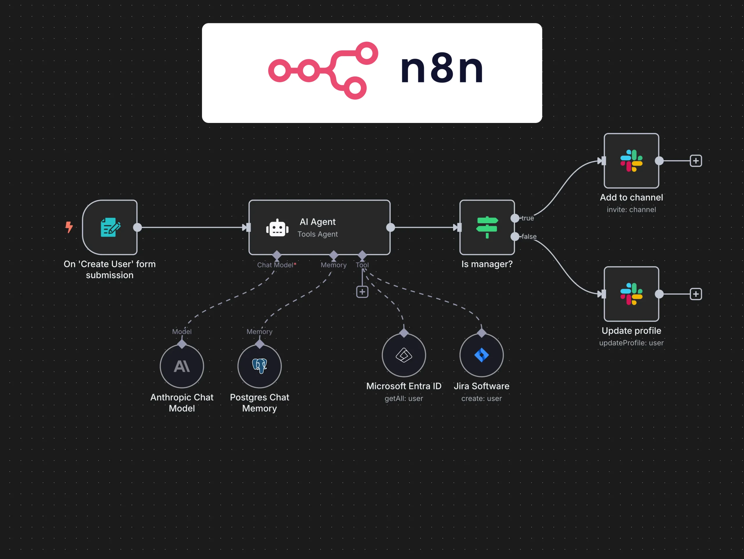
#section_2 { position: relative; padding: 6rem min(8vw, 6rem); background: linear-gradient(135deg, rgba(255, 92, 54, 0.12) 0%, rgba(9, 148, 115, 0.08) 46%, rgba(41, 128, 185, 0.12) 100%); overflow: hidden; } #section_2::before, #section_2::after { content: “”; position: absolute; border-radius: 50%; filter: blur(0); opacity: 0.3; pointer-events: none; transition: transform 0.6s ease, opacity 0.6s ease; } #section_2::before { top: -120px; right: -160px; width: 360px; height: 360px; background: radial-gradient(circle, rgba(255, 92, 54, 0.4), transparent 70%); } #section_2::after { bottom: -160px; left: -100px; width: 420px; height: 420px; background: radial-gradient(circle, rgba(9, 148, 115, 0.25), transparent 70%); } #section_2:hover::before, #section_2:hover::after { transform: scale(1.08); opacity: 0.4; } #section_2 .section-wrapper { position: relative; background: var(–white-color); border-radius: 32px; padding: clamp(2.5rem, 5vw, 3.5rem); box-shadow: 0 28px 60px rgba(17, 22, 51, 0.12); display: grid; grid-template-columns: minmax(0, 1.2fr) minmax(0, 0.9fr); gap: clamp(2rem, 4vw, 3rem); z-index: 1; } #section_2 .content-block h2 { font-size: clamp(2.3rem, 3.5vw, 3rem); color: var(–heading-color); line-height: 1.15; margin-bottom: 1.5rem; } #section_2 .content-block p { color: var(–text-color); font-size: 1.05rem; line-height: 1.75; margin-bottom: 1.75rem; } #section_2 .impact-grid { display: grid; grid-template-columns: repeat(2, minmax(0, 1fr)); gap: 1.2rem; margin-bottom: 2rem; } #section_2 .impact-card { background: var(–bg-variant); border-radius: 20px; padding: 1.5rem; display: flex; flex-direction: column; gap: 0.75rem; min-height: 160px; box-shadow: inset 0 0 0 1px rgba(255, 92, 54, 0.15); transition: transform 0.4s ease, box-shadow 0.4s ease; } #section_2 .impact-card i { font-size: 1.4rem; color: var(–main-color); } #section_2 .impact-card strong { color: var(–heading-color); font-size: 1.05rem; display: block; } #section_2 .impact-card span { color: rgba(17, 22, 51, 0.78); font-size: 0.95rem; line-height: 1.6; } #section_2 .impact-card:focus-visible, #section_2 .impact-card:hover { outline: none; transform: translateY(-6px); box-shadow: 0 22px 40px rgba(36, 47, 101, 0.16); } #section_2 .contact-panel { background: linear-gradient(160deg, var(–main-color), rgba(255, 92, 54, 0.85)); border-radius: 26px; padding: clamp(2rem, 4vw, 2.5rem); color: var(–white-color); display: flex; flex-direction: column; justify-content: space-between; gap: 1.75rem; position: relative; overflow: hidden; } #section_2 .contact-panel::after { content: “”; position: absolute; top: 30%; right: -40%; width: 75%; height: 75%; background: radial-gradient(circle, rgba(255, 255, 255, 0.22), transparent 65%); transform: rotate(18deg); } #section_2 .contact-panel h3 { font-size: 1.45rem; margin: 0; position: relative; z-index: 1; } #section_2 .contact-panel p { font-size: 1rem; line-height: 1.7; opacity: 0.94; margin: 0; position: relative; z-index: 1; } #section_2 .whatsapp-link { display: inline-flex; align-items: center; gap: 0.7rem; font-weight: 600; color: var(–white-color); position: relative; z-index: 1; transition: transform 0.3s ease, opacity 0.3s ease; } #section_2 .whatsapp-link i { font-size: 1.4rem; } #section_2 .whatsapp-link:focus-visible, #section_2 .whatsapp-link:hover { outline: none; transform: translateY(-2px); opacity: 0.85; } #section_2 .workflow-insight { display: grid; gap: 1.2rem; position: relative; z-index: 1; } #section_2 .workflow-insight .insight-badge { display: inline-flex; align-items: center; gap: 0.6rem; background: rgba(41, 128, 185, 0.12); color: var(–third-color); padding: 0.65rem 1.1rem; border-radius: 999px; font-size: 0.9rem; font-weight: 600; text-transform: uppercase; letter-spacing: 0.05em; } #section_2 .workflow-insight .insight-badge::before { content: “”; width: 10px; height: 10px; border-radius: 50%; background: var(–third-color); } #section_2 .workflow-insight ul { list-style: none; display: grid; gap: 0.95rem; padding: 0; margin: 0; } #section_2 .workflow-insight li { display: flex; align-items: flex-start; gap: 0.9rem; color: var(–text-color); font-size: 1rem; line-height: 1.7; animation: riseIn 0.7s ease forwards; opacity: 0; transform: translateY(18px); } #section_2 .workflow-insight li:nth-child(1) { animation-delay: 0.1s; } #section_2 .workflow-insight li:nth-child(2) { animation-delay: 0.2s; } #section_2 .workflow-insight li:nth-child(3) { animation-delay: 0.3s; } #section_2 .workflow-insight li:nth-child(4) { animation-delay: 0.4s; } #section_2 .workflow-insight li i { color: var(–secondary-color); font-size: 1.25rem; margin-top: 0.1rem; } @keyframes riseIn { to { opacity: 1; transform: translateY(0); } } @media (max-width: 1023px) { #section_2 { padding: 4.5rem clamp(1.8rem, 6vw, 3rem); } #section_2 .section-wrapper { grid-template-columns: 1fr; } #section_2 .contact-panel { flex-direction: column; } } @media (max-width: 767px) { #section_2 { padding: 3.5rem 1.5rem; } #section_2 .content-block h2 { font-size: 2.1rem; } #section_2 .impact-grid { grid-template-columns: 1fr; } #section_2 .impact-card { min-height: auto; } }
Nepal Growth Playbook

Why n8n Service in Nepal is a Growth Multiplier

Founders and operators choose n8n to unlock speed, accuracy, and scale without hiring sprees. With n8n, your processes run automatically across apps, APIs, and databases—freeing people to focus on revenue work.

  • Scale operations without extra headcount
  • Cut manual errors and SLA breaches
  • Ship faster—from lead capture to invoicing to follow-ups
  • Centralize data across tools so decisions are simpler
Faster Turnarounds Automated workflows keep Nepal’s fast-moving market on schedule.
Stronger Experiences Every customer touchpoint stays consistent, timely, and human.
Lean Operating Costs Automation replaces repetitive manual effort and reduces errors.
Resilient Workflows Our team maps goals, selects triggers, and handles edge cases.
/* Scoped Styles for Section 3 */ #section_3 { position: relative; padding: 80px 20px; background-color: var(–bg-color); font-family: ‘Lexend’, sans-serif; overflow: hidden; } /* Background Pattern for ‘Connectivity’ Vibe */ #section_3::before { content: ”; position: absolute; top: 0; left: 0; width: 100%; height: 100%; background-image: radial-gradient(var(–light-gray) 1px, transparent 1px); background-size: 30px 30px; opacity: 0.4; z-index: 0; } .n8n-container { position: relative; max-width: 1200px; margin: 0 auto; z-index: 2; } /* Header Styling */ .n8n-header { text-align: center; margin-bottom: 60px; max-width: 800px; margin-left: auto; margin-right: auto; } .n8n-header h2 { font-size: 2.5rem; color: var(–heading-color); margin-bottom: 20px; font-weight: 700; line-height: 1.2; } .n8n-header p { font-size: 1.125rem; color: var(–text-color); line-height: 1.6; opacity: 0.9; } /* Feature Grid – Bento Box Style */ .n8n-grid { display: grid; grid-template-columns: repeat(1, 1fr); gap: 24px; margin-bottom: 60px; } /* Card Styling */ .n8n-card { background: var(–white-color); padding: 32px; border-radius: 16px; box-shadow: 0 10px 30px rgba(0, 0, 0, 0.04); border: 1px solid rgba(255, 255, 255, 0.8); transition: all 0.4s cubic-bezier(0.165, 0.84, 0.44, 1); display: flex; flex-direction: column; align-items: flex-start; height: 100%; position: relative; overflow: hidden; } .n8n-card:hover { transform: translateY(-8px); box-shadow: 0 20px 40px rgba(0, 0, 0, 0.08); border-color: var(–main-color); } .n8n-card::after { content: ”; position: absolute; bottom: 0; left: 0; width: 100%; height: 4px; background: linear-gradient(90deg, var(–main-color), var(–secondary-color)); transform: scaleX(0); transform-origin: left; transition: transform 0.4s ease; } .n8n-card:hover::after { transform: scaleX(1); } /* Icons */ .card-icon-wrapper { width: 60px; height: 60px; background: var(–bg-variant); border-radius: 12px; display: flex; align-items: center; justify-content: center; margin-bottom: 24px; color: var(–main-color); font-size: 1.5rem; transition: transform 0.3s ease; } .n8n-card:nth-child(even) .card-icon-wrapper { background: #E8F8F5; /* Light version of secondary color */ color: var(–secondary-color); } .n8n-card:hover .card-icon-wrapper { transform: rotateY(180deg); } .n8n-card h3 { font-size: 1.25rem; color: var(–heading-color); margin-bottom: 12px; font-weight: 600; } .n8n-card p { font-size: 0.95rem; color: var(–text-color); line-height: 1.6; margin: 0; } /* Bottom Section */ .n8n-footer { text-align: center; background: var(–white-color); padding: 40px; border-radius: 20px; box-shadow: 0 15px 40px rgba(36, 47, 101, 0.06); border: 1px solid var(–light-gray); max-width: 900px; margin: 0 auto; } .n8n-footer-text { font-size: 1.1rem; color: var(–heading-color); font-weight: 500; margin-bottom: 30px; line-height: 1.6; } .cta-group { display: flex; justify-content: center; gap: 20px; flex-wrap: wrap; } /* Animation Classes */ .reveal-item { opacity: 0; transform: translateY(30px); transition: opacity 0.6s ease-out, transform 0.6s ease-out; } .reveal-item.visible { opacity: 1; transform: translateY(0); } /* Responsive Queries */ @media (min-width: 768px) { .n8n-grid { grid-template-columns: repeat(2, 1fr); } /* Span the last item if odd number */ .n8n-card:last-child:nth-child(odd) { grid-column: span 2; } } @media (min-width: 1024px) { .n8n-grid { grid-template-columns: repeat(3, 1fr); } /* Make first two items span appropriately to create a nice layout for 5 items */ .n8n-card:nth-child(1), .n8n-card:nth-child(2) { grid-column: span 6; /* If we used a 12 col grid concept, but here we keep simple */ } /* Reset grid for desktop custom layout */ .n8n-grid { display: flex; flex-wrap: wrap; justify-content: center; } .n8n-card { width: calc(33.333% – 24px); /* 3 in a row */ flex-grow: 1; } .n8n-card:nth-child(1), .n8n-card:nth-child(2) { width: calc(50% – 24px); /* Top 2 are wider */ } .n8n-header h2 { font-size: 3rem; } } @media (max-width: 767px) { .n8n-header h2 { font-size: 2rem; } .cta-group { flex-direction: column; align-items: center; } .n8n-footer { padding: 25px; } }

Why Use n8n—Not Just Another Automation Tool

Most tools are either too simple (hit a ceiling fast) or too complex (require heavy engineering). n8n is the sweet spot: visual, low-code, and endlessly extensible.

Self-host or cloud

Own your data, meet compliance, reduce SaaS lock-in.

500+ integrations + any API

Connect CRMs, payments, email, sheets, ERPs, and custom systems.

AI-native nodes

Build agentic workflows with LLMs for reasoning, enrichment, and decisions.

Low-code + code when needed

Visual nodes plus JavaScript/Python for edge logic.

Cost-efficient at scale

Replace multiple subscriptions and per-zap fees.

document.addEventListener(“DOMContentLoaded”, function() { const observerOptions = { threshold: 0.15, rootMargin: “0px” }; const observer = new IntersectionObserver((entries, observer) => { entries.forEach(entry => { if (entry.isIntersecting) { entry.target.classList.add(‘visible’); observer.unobserve(entry.target); } }); }, observerOptions); const items = document.querySelectorAll(‘#section_3 .reveal-item’); items.forEach(item => observer.observe(item)); });
/* Scoped CSS for Section 4 */ #section_4 { position: relative; padding: 80px 0; background-color: var(–bg-color, #f7f9fb); font-family: ‘Lexend’, sans-serif; overflow: hidden; } #section_4 .container { max-width: 1200px; margin: 0 auto; padding: 0 20px; } /* Header Styles */ #section_4 .section-header { text-align: center; max-width: 800px; margin: 0 auto 60px; } #section_4 .section-header h2 { font-size: 2.5rem; color: var(–heading-color, #242F65); margin-bottom: 20px; line-height: 1.2; font-weight: 700; } #section_4 .section-header p { font-size: 1.125rem; color: var(–text-color, #111633); line-height: 1.6; opacity: 0.9; } /* Main Content Grid */ #section_4 .content-grid { display: grid; grid-template-columns: 1fr 1fr; gap: 60px; align-items: center; } /* Column 1: Metrics (Results) */ #section_4 .metrics-wrapper { display: grid; grid-template-columns: repeat(2, 1fr); gap: 25px; } #section_4 .metric-card { background: var(–white-color, #ffffff); padding: 30px 25px; border-radius: 16px; box-shadow: 0 10px 30px rgba(0, 0, 0, 0.05); transition: transform 0.3s ease, box-shadow 0.3s ease; position: relative; overflow: hidden; display: flex; flex-direction: column; justify-content: center; height: 100%; } #section_4 .metric-card::before { content: ”; position: absolute; top: 0; left: 0; width: 4px; height: 100%; background: var(–main-color, #ff5c36); transition: height 0.3s ease; } #section_4 .metric-card:nth-child(2)::before, #section_4 .metric-card:nth-child(3)::before { background: var(–secondary-color, #059473); } #section_4 .metric-card:hover { transform: translateY(-5px); box-shadow: 0 15px 40px rgba(0, 0, 0, 0.08); } #section_4 .metric-icon { font-size: 2rem; color: var(–main-color, #ff5c36); margin-bottom: 15px; } #section_4 .metric-card:nth-child(2) .metric-icon, #section_4 .metric-card:nth-child(3) .metric-icon { color: var(–secondary-color, #059473); } #section_4 .metric-value { font-size: 1.5rem; font-weight: 700; color: var(–heading-color, #242F65); margin-bottom: 8px; display: block; } #section_4 .metric-desc { font-size: 0.95rem; color: var(–text-color, #111633); line-height: 1.4; opacity: 0.8; } /* Column 2: ROI Process */ #section_4 .roi-wrapper { padding-left: 20px; } #section_4 .roi-title { font-size: 1.75rem; color: var(–heading-color, #242F65); margin-bottom: 30px; font-weight: 600; position: relative; padding-left: 15px; } #section_4 .roi-title::before { content: ”; position: absolute; left: 0; top: 50%; transform: translateY(-50%); width: 4px; height: 24px; background: var(–secondary-color, #059473); border-radius: 2px; } #section_4 .roi-steps { list-style: none; padding: 0; margin: 0 0 40px 0; position: relative; } #section_4 .roi-step { display: flex; align-items: flex-start; margin-bottom: 25px; position: relative; } #section_4 .step-icon { width: 40px; height: 40px; border-radius: 50%; background: rgba(5, 148, 115, 0.1); color: var(–secondary-color, #059473); display: flex; align-items: center; justify-content: center; font-size: 1rem; flex-shrink: 0; margin-right: 15px; } #section_4 .step-text { font-size: 1.05rem; color: var(–text-color, #111633); line-height: 1.5; padding-top: 8px; } #section_4 .result-box { background: var(–bg-variant, #FFF4F2); border-left: 4px solid var(–main-color, #ff5c36); padding: 20px 25px; border-radius: 0 12px 12px 0; margin-bottom: 30px; } #section_4 .result-text { color: var(–heading-color, #242F65); font-weight: 500; font-size: 1.05rem; line-height: 1.6; } #section_4 .cta-wrapper { margin-top: 20px; } /* Responsive Design */ @media (max-width: 1024px) { #section_4 .content-grid { gap: 40px; } #section_4 .metrics-wrapper { gap: 20px; } } @media (max-width: 768px) { #section_4 { padding: 60px 0; } #section_4 .section-header h2 { font-size: 2rem; } #section_4 .content-grid { grid-template-columns: 1fr; } #section_4 .metrics-wrapper { order: 2; /* Move metrics below process on mobile if desired, or keep 1 */ } #section_4 .roi-wrapper { padding-left: 0; margin-bottom: 40px; } } @media (max-width: 480px) { #section_4 .metrics-wrapper { grid-template-columns: 1fr; } #section_4 .section-header h2 { font-size: 1.75rem; } }

Outcomes You Can Measure—Not Just Promises

Automation must pay back quickly. We design metrics into every workflow so you see the impact in days, not months.

40–70% Reduction in manual processing time per workflow
2–5x Faster lead response and follow-up times
30–60% Fewer errors in data entry and handoffs
24/7 Always-on operations with alerts and retries

How we ensure ROI

  • Choose one or two high-leverage processes for a pilot
  • Track baseline vs. post-automation KPIs
  • Iterate weekly based on logs and team feedback
  • Scale to adjacent processes once value is proven

Result: a compounding system that keeps getting faster and cheaper as you automate more.

// Simple intersection observer for fade-in animations document.addEventListener(‘DOMContentLoaded’, () => { const observerOptions = { threshold: 0.1 }; const observer = new IntersectionObserver((entries) => { entries.forEach(entry => { if (entry.isIntersecting) { entry.target.style.opacity = ‘1’; entry.target.style.transform = ‘translateY(0)’; observer.unobserve(entry.target); } }); }, observerOptions); // Select elements to animate const animateElements = document.querySelectorAll(‘#section_4 .metric-card, #section_4 .roi-step, #section_4 .result-box’); animateElements.forEach((el, index) => { el.style.opacity = ‘0’; el.style.transform = ‘translateY(20px)’; el.style.transition = `opacity 0.6s ease ${index * 0.1}s, transform 0.6s ease ${index * 0.1}s, box-shadow 0.3s ease`; // maintain hover transition observer.observe(el); }); });
/* Scoped Styles for Section 5 */ #section_5 { position: relative; padding: 5rem 1rem; background-color: var(–bg-color); font-family: ‘Lexend’, sans-serif; overflow: hidden; } #section_5 .container { max-width: 1280px; margin: 0 auto; width: 100%; position: relative; z-index: 2; } /* Section Header */ #section_5 .header-block { text-align: center; max-width: 800px; margin: 0 auto 4rem; } #section_5 .header-block h2 { font-size: 2.5rem; font-weight: 700; color: var(–heading-color); margin-bottom: 1.5rem; line-height: 1.2; } #section_5 .header-block p { font-size: 1.125rem; color: var(–text-color); line-height: 1.6; opacity: 0.9; } /* Grid Layout */ #section_5 .automation-grid { display: grid; grid-template-columns: repeat(auto-fit, minmax(320px, 1fr)); gap: 2rem; margin-bottom: 4rem; } /* Card Styling */ #section_5 .automation-card { background: var(–white-color); border-radius: 16px; padding: 2.5rem 2rem; box-shadow: 0 10px 30px rgba(0, 0, 0, 0.05); transition: all 0.4s cubic-bezier(0.175, 0.885, 0.32, 1.275); border: 1px solid transparent; display: flex; flex-direction: column; height: 100%; position: relative; overflow: hidden; opacity: 0; /* For animation */ transform: translateY(30px); } #section_5 .automation-card:hover { transform: translateY(-8px); box-shadow: 0 20px 40px rgba(0, 0, 0, 0.08); border-color: var(–light-gray); } #section_5 .automation-card::before { content: ”; position: absolute; top: 0; left: 0; width: 4px; height: 0; background: var(–main-color); transition: height 0.4s ease; } #section_5 .automation-card:hover::before { height: 100%; } /* Icon Styling */ #section_5 .card-icon { width: 60px; height: 60px; background-color: var(–bg-variant); border-radius: 12px; display: flex; align-items: center; justify-content: center; margin-bottom: 1.5rem; transition: background-color 0.3s ease; } #section_5 .card-icon i { font-size: 1.75rem; color: var(–main-color); transition: color 0.3s ease; } #section_5 .automation-card:hover .card-icon { background-color: var(–main-color); } #section_5 .automation-card:hover .card-icon i { color: var(–white-color); } /* Card Content */ #section_5 .card-title { font-size: 1.5rem; font-weight: 600; color: var(–heading-color); margin-bottom: 1rem; } #section_5 .feature-list { list-style: none; padding: 0; margin: 0; } #section_5 .feature-list li { position: relative; padding-left: 1.5rem; margin-bottom: 0.75rem; color: var(–text-color); font-size: 0.95rem; line-height: 1.5; } #section_5 .feature-list li::before { content: ‘\f00c’; /* FontAwesome Check */ font-family: ‘Font Awesome 6 Free’; font-weight: 900; position: absolute; left: 0; top: 2px; color: var(–secondary-color); font-size: 0.85rem; } /* Specific Card Accents */ #section_5 .automation-card:nth-child(2) .card-icon { background-color: #E8F6F3; } #section_5 .automation-card:nth-child(2) .card-icon i { color: var(–secondary-color); } #section_5 .automation-card:nth-child(2):hover .card-icon { background-color: var(–secondary-color); } #section_5 .automation-card:nth-child(2):hover .card-icon i { color: white; } #section_5 .automation-card:nth-child(2)::before { background: var(–secondary-color); } #section_5 .automation-card:nth-child(3) .card-icon { background-color: #EBF5FB; } #section_5 .automation-card:nth-child(3) .card-icon i { color: var(–third-color); } #section_5 .automation-card:nth-child(3):hover .card-icon { background-color: var(–third-color); } #section_5 .automation-card:nth-child(3):hover .card-icon i { color: white; } #section_5 .automation-card:nth-child(3)::before { background: var(–third-color); } #section_5 .automation-card:nth-child(4) .card-icon { background-color: #f0f0f5; } #section_5 .automation-card:nth-child(4) .card-icon i { color: var(–heading-color); } #section_5 .automation-card:nth-child(4):hover .card-icon { background-color: var(–heading-color); } #section_5 .automation-card:nth-child(4):hover .card-icon i { color: white; } #section_5 .automation-card:nth-child(4)::before { background: var(–heading-color); } /* Footer Section */ #section_5 .bottom-content { text-align: center; max-width: 700px; margin: 0 auto; background: var(–white-color); padding: 3rem; border-radius: 20px; box-shadow: 0 10px 40px rgba(0,0,0,0.06); position: relative; overflow: hidden; opacity: 0; /* For animation */ transform: translateY(20px); } #section_5 .bottom-content::before { content: ”; position: absolute; top: 0; left: 0; width: 100%; height: 4px; background: linear-gradient(90deg, var(–main-color), var(–secondary-color)); } #section_5 .bottom-content p { font-size: 1.125rem; color: var(–text-color); margin-bottom: 2rem; font-weight: 500; line-height: 1.6; } /* Responsive Adjustments */ @media (max-width: 1024px) { #section_5 .header-block h2 { font-size: 2.25rem; } #section_5 .automation-grid { grid-template-columns: repeat(2, 1fr); } /* Center last item if odd number */ #section_5 .automation-card:last-child { grid-column: span 2; max-width: 600px; margin: 0 auto; width: 100%; } } @media (max-width: 768px) { #section_5 { padding: 3.5rem 1rem; } #section_5 .header-block h2 { font-size: 1.85rem; } #section_5 .automation-grid { grid-template-columns: 1fr; gap: 1.5rem; } #section_5 .automation-card:last-child { grid-column: auto; max-width: none; } #section_5 .bottom-content { padding: 2rem 1.5rem; } } /* Animation Classes */ #section_5 .animate-fade-up { animation: fadeInUp 0.8s ease forwards; } @keyframes fadeInUp { from { opacity: 0; transform: translateY(30px); } to { opacity: 1; transform: translateY(0); } }

What We Automate with n8n

From simple triggers to multi-step, AI-backed workflows, we cover the full business stack.

Sales

  • Lead capture & scoring
  • CRM synchronization
  • WhatsApp/Email follow-ups
  • Deal stage automation

Marketing

  • Campaign orchestration
  • UTM hygiene management
  • Content distribution
  • Analytics consolidation

Operations

  • Order processing
  • Vendor updates
  • Inventory checks
  • Internal notifications

Finance

  • Invoice creation
  • Payment reconciliation
  • Payout reminders
  • Expense synchronization

Support

  • Multi-channel ticketing
  • SLA monitoring & timers
  • Satisfaction feedback loops
  • Escalation rules

We start where time is leaking most. Then we build reusable components so new automations launch faster and cost less.

Chat on WhatsApp
document.addEventListener(“DOMContentLoaded”, function() { const section = document.querySelector(“#section_5”); const cards = section.querySelectorAll(“.automation-card”); const bottomContent = section.querySelector(“.bottom-content”); const observerOptions = { threshold: 0.1, rootMargin: “0px 0px -50px 0px” }; const observer = new IntersectionObserver((entries, observer) => { entries.forEach(entry => { if (entry.isIntersecting) { // Animate cards with stagger cards.forEach((card, index) => { setTimeout(() => { card.classList.add(“animate-fade-up”); }, index * 100); }); // Animate bottom content after cards setTimeout(() => { bottomContent.classList.add(“animate-fade-up”); }, cards.length * 100 + 200); observer.unobserve(entry.target); } }); }, observerOptions); observer.observe(section); });
#section_6 { padding: 80px 0; background-color: var(–bg-color); font-family: ‘Lexend’, sans-serif; position: relative; overflow: hidden; } #section_6 .s6-container { max-width: 1200px; margin: 0 auto; padding: 0 24px; display: grid; grid-template-columns: 1fr; gap: 50px; } /* Header Section */ #section_6 .s6-header { text-align: center; max-width: 800px; margin: 0 auto; } #section_6 h2 { font-size: 2.5rem; color: var(–heading-color); font-weight: 700; margin-bottom: 20px; line-height: 1.2; } #section_6 .s6-intro-text { font-size: 1.125rem; color: var(–text-color); line-height: 1.6; opacity: 0.9; } /* Feature Grid */ #section_6 .s6-grid { display: grid; grid-template-columns: repeat(2, 1fr); gap: 30px; margin-top: 20px; } #section_6 .s6-card { background: var(–white-color); padding: 35px; border-radius: 20px; box-shadow: 0 10px 30px rgba(0, 0, 0, 0.04); transition: all 0.4s ease; position: relative; border: 1px solid transparent; overflow: hidden; display: flex; flex-direction: column; align-items: flex-start; gap: 15px; } #section_6 .s6-card:hover { transform: translateY(-8px); box-shadow: 0 20px 40px rgba(0, 0, 0, 0.08); border-color: rgba(5, 148, 115, 0.2); /* Secondary color hint */ } #section_6 .s6-icon-box { width: 60px; height: 60px; background: var(–bg-variant); border-radius: 12px; display: flex; align-items: center; justify-content: center; font-size: 1.5rem; color: var(–main-color); margin-bottom: 5px; transition: background 0.3s ease; } #section_6 .s6-card:hover .s6-icon-box { background: var(–main-color); color: var(–white-color); } #section_6 .s6-card h3 { font-size: 1.25rem; color: var(–heading-color); font-weight: 600; margin: 0; } #section_6 .s6-card p { font-size: 1rem; color: var(–text-color); line-height: 1.5; margin: 0; opacity: 0.8; } /* Conclusion Section */ #section_6 .s6-conclusion-wrapper { background: var(–white-color); border-radius: 24px; padding: 50px; display: flex; flex-direction: column; align-items: center; text-align: center; gap: 30px; box-shadow: 0 15px 40px rgba(36, 47, 101, 0.06); border: 1px solid var(–light-gray); margin-top: 20px; position: relative; } #section_6 .s6-conclusion-wrapper::before { content: ”; position: absolute; top: 0; left: 0; width: 100%; height: 6px; background: linear-gradient(90deg, var(–main-color), var(–secondary-color)); } #section_6 .s6-conclusion-text { font-size: 1.25rem; color: var(–heading-color); max-width: 900px; line-height: 1.6; font-weight: 500; } #section_6 .s6-conclusion-text strong { color: var(–secondary-color); font-weight: 700; } #section_6 .s6-subtext { font-size: 1rem; color: var(–text-color); opacity: 0.8; max-width: 800px; } /* Responsive Design */ @media (max-width: 1024px) { #section_6 .s6-grid { gap: 20px; } #section_6 h2 { font-size: 2.2rem; } } @media (max-width: 768px) { #section_6 { padding: 60px 0; } #section_6 .s6-grid { grid-template-columns: 1fr; } #section_6 .s6-conclusion-wrapper { padding: 30px 20px; } #section_6 h2 { font-size: 1.8rem; } #section_6 .s6-conclusion-text { font-size: 1.1rem; } }

AI + n8n = Your 24/7 Digital Team Member

AI on its own can’t act inside your tools. n8n is the execution layer that lets AI read data, take actions, and close loops.

AI Agents

Agents that triage leads, enrich tickets, and draft responses automatically.

Natural Language to Actions

Simply ask for outcomes in plain English, and workflows execute the necessary steps.

Smart Routing

AI decides the next steps based on real-time context and historical data analysis.

Data Prep for AI

Clean, transform, and validate data before it hits your AI models for better accuracy.

Effectively, you gain a low-cost, always-available employee that never forgets a step, logs everything, and improves over time.

We design guardrails so your AI stays accurate, auditable, and on-brand.

Chat on WhatsApp
// Simple intersection observer for fade-up animations document.addEventListener(“DOMContentLoaded”, function() { const observerOptions = { threshold: 0.1 }; const observer = new IntersectionObserver((entries) => { entries.forEach(entry => { if (entry.isIntersecting) { entry.target.style.opacity = “1”; entry.target.style.transform = “translateY(0)”; } }); }, observerOptions); const animElements = document.querySelectorAll(‘#section_6 .s6-card, #section_6 .s6-header, #section_6 .s6-conclusion-wrapper’); animElements.forEach(el => { el.style.opacity = “0”; el.style.transform = “translateY(20px)”; el.style.transition = “opacity 0.6s ease-out, transform 0.6s ease-out”; observer.observe(el); }); });
/* Scoped CSS for Section 7 */ #section_7 { position: relative; padding: 80px 0; background-color: var(–bg-color); overflow: hidden; font-family: ‘Lexend’, sans-serif; } #section_7 .container { max-width: 1200px; margin: 0 auto; padding: 0 20px; } /* Header */ #section_7 .process-header { text-align: center; margin-bottom: 60px; max-width: 800px; margin-left: auto; margin-right: auto; } #section_7 .process-header h2 { font-size: 2.5rem; font-weight: 700; color: var(–heading-color); margin-bottom: 15px; line-height: 1.2; } #section_7 .process-header p { font-size: 1.125rem; color: var(–text-color); opacity: 0.8; } /* Timeline Container */ #section_7 .timeline-wrapper { position: relative; padding: 20px 0; } /* Vertical Line */ #section_7 .timeline-wrapper::before { content: ”; position: absolute; top: 0; bottom: 0; left: 50%; width: 4px; background: var(–light-gray); transform: translateX(-50%); border-radius: 2px; z-index: 0; } /* Timeline Item */ #section_7 .timeline-item { position: relative; margin-bottom: 50px; width: 100%; display: flex; justify-content: center; align-items: center; opacity: 0; transform: translateY(30px); transition: all 0.6s cubic-bezier(0.25, 1, 0.5, 1); } #section_7 .timeline-item.visible { opacity: 1; transform: translateY(0); } /* Content Box */ #section_7 .timeline-content { width: 45%; background: var(–white-color); padding: 30px; border-radius: 16px; box-shadow: 0 10px 30px rgba(0, 0, 0, 0.05); position: relative; z-index: 2; border: 1px solid rgba(0, 0, 0, 0.03); transition: transform 0.3s ease, box-shadow 0.3s ease; } #section_7 .timeline-content:hover { transform: translateY(-5px); box-shadow: 0 15px 40px rgba(0, 0, 0, 0.08); border-color: var(–main-color); } /* Alternating Sides */ #section_7 .timeline-item:nth-child(odd) { justify-content: flex-start; } #section_7 .timeline-item:nth-child(even) { justify-content: flex-end; } /* The Dot */ #section_7 .timeline-dot { position: absolute; left: 50%; top: 50%; transform: translate(-50%, -50%); width: 50px; height: 50px; background-color: var(–main-color); border: 4px solid var(–white-color); border-radius: 50%; display: flex; align-items: center; justify-content: center; color: var(–white-color); font-weight: 700; font-size: 1.2rem; box-shadow: 0 0 0 4px rgba(255, 92, 54, 0.2); z-index: 3; } /* Typography inside cards */ #section_7 .timeline-content h3 { font-size: 1.25rem; color: var(–heading-color); font-weight: 700; margin-bottom: 5px; display: flex; align-items: center; gap: 10px; } #section_7 .time-badge { font-size: 0.85rem; background-color: var(–bg-variant); color: var(–main-color); padding: 4px 10px; border-radius: 20px; font-weight: 600; white-space: nowrap; } #section_7 .timeline-content p { color: var(–text-color); line-height: 1.6; font-size: 0.95rem; margin: 0; } /* Connector Line for visual flow */ #section_7 .timeline-item:nth-child(odd) .timeline-content::after { content: ”; position: absolute; top: 50%; right: -20px; width: 20px; height: 2px; background: var(–light-gray); transform: translateY(-50%); } #section_7 .timeline-item:nth-child(even) .timeline-content::after { content: ”; position: absolute; top: 50%; left: -20px; width: 20px; height: 2px; background: var(–light-gray); transform: translateY(-50%); } /* Footer & Conclusion */ #section_7 .process-footer { text-align: center; margin-top: 60px; background: var(–white-color); padding: 40px; border-radius: 16px; box-shadow: 0 10px 30px rgba(0, 0, 0, 0.03); max-width: 900px; margin-left: auto; margin-right: auto; position: relative; z-index: 2; } #section_7 .process-footer p { font-size: 1.1rem; color: var(–heading-color); margin-bottom: 30px; line-height: 1.6; font-weight: 500; } #section_7 .cta-group { display: flex; justify-content: center; gap: 20px; flex-wrap: wrap; } /* Responsive Design */ @media (max-width: 1024px) { #section_7 .process-header h2 { font-size: 2rem; } } @media (max-width: 768px) { #section_7 .timeline-wrapper::before { left: 20px; } #section_7 .timeline-item { justify-content: flex-start !important; padding-left: 60px; } #section_7 .timeline-dot { left: 20px; width: 40px; height: 40px; font-size: 1rem; } #section_7 .timeline-content { width: 100%; } #section_7 .timeline-item:nth-child(odd) .timeline-content::after, #section_7 .timeline-item:nth-child(even) .timeline-content::after { right: 100%; left: auto; width: 20px; background: var(–light-gray); display: none; /* Hide connector on mobile for cleaner look */ } #section_7 .timeline-content::before { content: ”; position: absolute; left: -15px; top: 50%; transform: translateY(-50%); border-width: 10px; border-style: solid; border-color: transparent var(–white-color) transparent transparent; } } @media (max-width: 480px) { #section_7 .process-header h2 { font-size: 1.75rem; } #section_7 .cta-group { flex-direction: column; align-items: center; } #section_7 .timeline-content h3 { flex-direction: column; align-items: flex-start; } }

Our Process—Fast, Clear, and Built for Scale

We keep it simple and outcome-driven.

1

Discovery & Priority 1–2 days

Map goals, systems, and ROI opportunities.

2

Design & Architecture 2–4 days

Draft workflow maps, data model, alerts, SLAs.

3

Pilot Build 1–2 weeks

Deploy a high-impact automation with logs and dashboards.

4

Stabilize & Train 3–5 days

QA, edge-case handling, team training, playbooks.

5

Scale & Support ongoing

Add workflows, review KPIs monthly, optimize costs.

document.addEventListener(“DOMContentLoaded”, function() { const observerOptions = { threshold: 0.15, rootMargin: “0px” }; const observer = new IntersectionObserver((entries, observer) => { entries.forEach(entry => { if (entry.isIntersecting) { entry.target.classList.add(‘visible’); observer.unobserve(entry.target); } }); }, observerOptions); const timelineItems = document.querySelectorAll(‘#section_7 .timeline-item’); timelineItems.forEach((item, index) => { // Stagger delay for smoother initial load item.style.transitionDelay = `${index * 0.1}s`; observer.observe(item); }); const footer = document.querySelector(‘#section_7 .process-footer’); if(footer) { observer.observe(footer); footer.style.opacity = ‘0’; footer.style.transform = ‘translateY(20px)’; footer.style.transition = ‘all 0.6s ease’; } // Separate observer logic for footer to handle its own animation class simply const footerObserver = new IntersectionObserver((entries) => { entries.forEach(entry => { if(entry.isIntersecting) { entry.target.style.opacity = ‘1’; entry.target.style.transform = ‘translateY(0)’; } }); }, { threshold: 0.2 }); if(footer) footerObserver.observe(footer); });
/* Section Scoping */ .sec-data-security { position: relative; padding: 80px 0; background: linear-gradient(135deg, var(–bg-color) 0%, var(–white-color) 100%); font-family: ‘Lexend’, sans-serif; overflow: hidden; } .sec-data-security .container { width: 100%; max-width: 1200px; margin: 0 auto; padding: 0 20px; position: relative; z-index: 2; } /* Decorative Background Elements */ .sec-data-security::before { content: ”; position: absolute; top: -100px; right: -100px; width: 400px; height: 400px; background: radial-gradient(circle, rgba(5, 148, 115, 0.05) 0%, rgba(255, 255, 255, 0) 70%); border-radius: 50%; z-index: 1; } .sec-data-security::after { content: ”; position: absolute; bottom: -50px; left: -50px; width: 300px; height: 300px; background: radial-gradient(circle, rgba(41, 128, 185, 0.05) 0%, rgba(255, 255, 255, 0) 70%); border-radius: 50%; z-index: 1; } /* Header */ .sec-data-security .sec-header { text-align: center; margin-bottom: 60px; max-width: 800px; margin-left: auto; margin-right: auto; } .sec-data-security .sec-header h2 { font-size: 2.5rem; color: var(–heading-color); margin-bottom: 16px; font-weight: 700; line-height: 1.2; } .sec-data-security .sec-header p { font-size: 1.125rem; color: var(–text-color); opacity: 0.8; line-height: 1.6; } /* Grid Layout */ .sec-data-security .content-grid { display: grid; grid-template-columns: 1fr; gap: 40px; } @media (min-width: 992px) { .sec-data-security .content-grid { grid-template-columns: 1fr 1fr; gap: 60px; align-items: stretch; } } /* Columns */ .sec-data-security .col-box { background: var(–white-color); border-radius: 20px; padding: 40px; box-shadow: 0 10px 30px rgba(0, 0, 0, 0.04); border: 1px solid var(–light-gray); transition: transform 0.3s ease, box-shadow 0.3s ease; display: flex; flex-direction: column; } .sec-data-security .col-box:hover { transform: translateY(-5px); box-shadow: 0 15px 40px rgba(0, 0, 0, 0.08); border-color: var(–third-color); } .sec-data-security .col-title { font-size: 1.5rem; color: var(–heading-color); margin-bottom: 30px; display: flex; align-items: center; gap: 12px; font-weight: 600; border-bottom: 2px solid var(–bg-variant); padding-bottom: 15px; } .sec-data-security .col-title i { color: var(–third-color); background: var(–bg-variant); padding: 10px; border-radius: 12px; font-size: 1.2rem; } /* List Items */ .sec-data-security .feature-list { list-style: none; padding: 0; margin: 0; display: flex; flex-direction: column; gap: 20px; flex-grow: 1; } .sec-data-security .feature-item { display: flex; align-items: flex-start; gap: 15px; } .sec-data-security .icon-box { flex-shrink: 0; width: 40px; height: 40px; border-radius: 50%; display: flex; align-items: center; justify-content: center; font-size: 1rem; transition: all 0.3s ease; } /* Option Colors */ .sec-data-security .opt-host .icon-box { background: rgba(41, 128, 185, 0.1); color: var(–third-color); } .sec-data-security .opt-sec .icon-box { background: rgba(5, 148, 115, 0.1); color: var(–secondary-color); } .sec-data-security .feature-content h4 { font-size: 1.1rem; color: var(–heading-color); margin: 0 0 6px 0; font-weight: 600; } .sec-data-security .feature-content p { font-size: 0.95rem; color: var(–text-color); line-height: 1.5; margin: 0; opacity: 0.85; } /* Bottom Section */ .sec-data-security .sec-footer { margin-top: 60px; text-align: center; background: var(–white-color); padding: 40px; border-radius: 20px; box-shadow: 0 5px 20px rgba(0,0,0,0.03); border: 1px solid var(–light-gray); position: relative; overflow: hidden; } .sec-data-security .sec-footer::before { content: ”; position: absolute; top: 0; left: 0; width: 4px; height: 100%; background: var(–main-color); } .sec-data-security .sec-footer p { font-size: 1.2rem; color: var(–heading-color); font-weight: 500; margin-bottom: 30px; max-width: 800px; margin-left: auto; margin-right: auto; } .sec-data-security .btn-group { display: flex; justify-content: center; gap: 20px; flex-wrap: wrap; } /* Responsive adjustments */ @media (max-width: 768px) { .sec-data-security { padding: 60px 0; } .sec-data-security .sec-header h2 { font-size: 2rem; } .sec-data-security .col-box { padding: 25px; } .sec-data-security .sec-footer { padding: 30px 20px; } .sec-data-security .sec-footer p { font-size: 1rem; } } /* Animation Classes */ .sec-data-security .anim-fade-up { opacity: 0; transform: translateY(30px); transition: opacity 0.6s ease-out, transform 0.6s ease-out; } .sec-data-security .anim-fade-up.visible { opacity: 1; transform: translateY(0); } .sec-data-security .delay-100 { transition-delay: 0.1s; } .sec-data-security .delay-200 { transition-delay: 0.2s; }

Data Ownership, Hosting, and Security

n8n gives you real control over data and compliance.

Hosting Options

  • Self-hosting

    VPS or on-prem with Docker, SSO, RBAC, encrypted secrets.

  • Cloud

    Quick start with role-based access and audit trails.

  • Hybrid

    Sensitive flows on-prem; non-critical in cloud.

Security Best Practices

  • Access Control

    Least-privilege API access and secret rotation.

  • Versioning & Monitoring

    Workflow versioning, logs, and alerting.

  • Reliability & Audit

    Backups, retries, idempotency, and auditability.

document.addEventListener(‘DOMContentLoaded’, function() { const observerOptions = { threshold: 0.15, rootMargin: “0px” }; const observer = new IntersectionObserver((entries) => { entries.forEach(entry => { if (entry.isIntersecting) { entry.target.classList.add(‘visible’); observer.unobserve(entry.target); } }); }, observerOptions); const animatedElements = document.querySelectorAll(‘.sec-data-security .anim-fade-up’); animatedElements.forEach(el => observer.observe(el)); });
/* Scoped Styles for Section 9 */ .pricing-engagement-section { position: relative; padding: 80px 20px; background-color: var(–white-color); font-family: ‘Lexend’, sans-serif; overflow: hidden; } .pricing-container { max-width: 1200px; margin: 0 auto; position: relative; z-index: 2; } /* Header */ .pricing-header { text-align: center; max-width: 700px; margin: 0 auto 60px; } .pricing-header h2 { font-size: 2.5rem; font-weight: 700; color: var(–heading-color); margin-bottom: 20px; line-height: 1.2; } .pricing-header p { font-size: 1.125rem; color: var(–text-color); line-height: 1.6; opacity: 0.9; } /* Grid Layout */ .pricing-grid { display: grid; grid-template-columns: 1fr 1fr; gap: 40px; margin-bottom: 50px; } /* Cards */ .pricing-card { background: var(–bg-color); padding: 40px; border-radius: 16px; transition: transform 0.3s ease, box-shadow 0.3s ease; position: relative; border: 1px solid var(–light-gray); height: 100%; display: flex; flex-direction: column; } .pricing-card:hover { transform: translateY(-5px); box-shadow: 0 15px 30px rgba(0, 0, 0, 0.05); border-color: transparent; } .card-icon-wrapper { width: 60px; height: 60px; border-radius: 12px; display: flex; align-items: center; justify-content: center; margin-bottom: 25px; font-size: 1.5rem; } .card-title { font-size: 1.5rem; font-weight: 600; color: var(–heading-color); margin-bottom: 25px; position: relative; padding-bottom: 15px; } .card-title::after { content: ”; position: absolute; left: 0; bottom: 0; width: 50px; height: 3px; border-radius: 2px; } /* Specific Card Styles */ .pricing-card.structure .card-icon-wrapper { background-color: rgba(5, 148, 115, 0.1); color: var(–secondary-color); } .pricing-card.structure .card-title::after { background-color: var(–secondary-color); } .pricing-card.cost .card-icon-wrapper { background-color: rgba(255, 92, 54, 0.1); color: var(–main-color); } .pricing-card.cost .card-title::after { background-color: var(–main-color); } /* Lists */ .pricing-list { list-style: none; padding: 0; margin: 0; } .pricing-list li { position: relative; padding-left: 35px; margin-bottom: 18px; color: var(–text-color); font-size: 1rem; line-height: 1.5; } .pricing-list li strong { color: var(–heading-color); font-weight: 600; } .pricing-list li i { position: absolute; left: 0; top: 4px; font-size: 1.1rem; } .pricing-card.structure li i { color: var(–secondary-color); } .pricing-card.cost li i { color: var(–main-color); } /* Outcome Section */ .outcome-block { background: var(–bg-variant); border-left: 5px solid var(–third-color); padding: 30px; border-radius: 8px; margin-bottom: 50px; text-align: center; } .outcome-block h3 { font-size: 1.25rem; color: var(–heading-color); margin-bottom: 10px; font-weight: 700; } .outcome-block p { color: var(–text-color); font-size: 1.05rem; margin: 0; } /* CTA Area */ .cta-group { display: flex; align-items: center; justify-content: center; gap: 20px; flex-wrap: wrap; } .whatsapp-link { display: inline-flex; align-items: center; gap: 10px; color: var(–heading-color); font-weight: 600; text-decoration: none; transition: color 0.3s ease; font-size: 1rem; } .whatsapp-link:hover { color: #25D366; /* WhatsApp Brand Color hover */ } .whatsapp-link i { font-size: 1.4rem; color: #25D366; } /* Animation Classes */ .reveal-item { opacity: 0; transform: translateY(30px); transition: all 0.8s cubic-bezier(0.25, 1, 0.5, 1); } .reveal-item.active { opacity: 1; transform: translateY(0); } /* Responsive Design */ @media (max-width: 991px) { .pricing-grid { grid-template-columns: 1fr; gap: 30px; } .pricing-header h2 { font-size: 2rem; } } @media (max-width: 767px) { .pricing-engagement-section { padding: 60px 20px; } .pricing-header h2 { font-size: 1.75rem; } .cta-group { flex-direction: column; gap: 20px; } .pricing-card { padding: 30px 20px; } }

Pricing & Engagement That Fit Your Stage

We tailor scope to your goals and timelines—no bloated retainers.

How we structure work

  • Pilot first: one high-ROI workflow to prove value fast
  • Fixed-scope builds: predictable delivery for defined automations
  • Ongoing optimization: monthly improvements driven by logs and KPIs

What affects cost

  • Number of systems and APIs
  • AI usage and model calls
  • Hosting (self-host vs. cloud)
  • Monitoring depth and SLAs

Outcome

You pay for measurable impact, not hours spent. Expect a quick payback when we start with the highest-leverage processes.

document.addEventListener(“DOMContentLoaded”, function() { const observerOptions = { root: null, rootMargin: ‘0px’, threshold: 0.15 }; const observer = new IntersectionObserver((entries, observer) => { entries.forEach(entry => { if (entry.isIntersecting) { entry.target.classList.add(‘active’); observer.unobserve(entry.target); } }); }, observerOptions); const elements = document.querySelectorAll(‘.pricing-engagement-section .reveal-item’); elements.forEach(el => observer.observe(el)); });
/* Scoped CSS for Section 10 */ #section_10 { position: relative; padding: 80px 20px; background-color: var(–bg-color); font-family: ‘Lexend’, sans-serif; overflow: hidden; } /* Decorative Background Elements */ #section_10::before { content: ”; position: absolute; top: -100px; right: -100px; width: 400px; height: 400px; background: radial-gradient(circle, rgba(255, 92, 54, 0.05) 0%, rgba(255, 255, 255, 0) 70%); z-index: 0; pointer-events: none; } #section_10::after { content: ”; position: absolute; bottom: -100px; left: -100px; width: 400px; height: 400px; background: radial-gradient(circle, rgba(5, 148, 115, 0.05) 0%, rgba(255, 255, 255, 0) 70%); z-index: 0; pointer-events: none; } .container-10 { max-width: 1200px; margin: 0 auto; position: relative; z-index: 1; } /* Header Styling */ .header-10 { text-align: center; margin-bottom: 60px; max-width: 800px; margin-left: auto; margin-right: auto; } .header-10 h2 { font-size: 2.5rem; color: var(–heading-color); margin-bottom: 16px; font-weight: 700; line-height: 1.2; opacity: 0; transform: translateY(20px); animation: fadeInUp 0.8s ease forwards; } .header-10 p { font-size: 1.125rem; color: var(–text-color); opacity: 0.8; line-height: 1.6; opacity: 0; transform: translateY(20px); animation: fadeInUp 0.8s ease forwards 0.2s; } /* Grid Layout */ .integration-grid { display: grid; grid-template-columns: repeat(3, 1fr); gap: 30px; margin-bottom: 60px; } /* Card Styling */ .int-card { background: var(–white-color); border-radius: 20px; padding: 35px 30px; box-shadow: 0 10px 30px rgba(0, 0, 0, 0.03); border: 1px solid rgba(0, 0, 0, 0.03); transition: all 0.4s cubic-bezier(0.165, 0.84, 0.44, 1); opacity: 0; transform: translateY(30px); display: flex; flex-direction: column; height: 100%; } .int-card.visible { opacity: 1; transform: translateY(0); } .int-card:hover { transform: translateY(-8px); box-shadow: 0 20px 40px rgba(0, 0, 0, 0.08); border-color: rgba(255, 92, 54, 0.2); } .icon-wrapper { width: 60px; height: 60px; border-radius: 16px; display: flex; align-items: center; justify-content: center; font-size: 1.5rem; margin-bottom: 24px; transition: background 0.3s ease; } /* Specific Icon Colors based on content */ .crm-icon { background: rgba(255, 92, 54, 0.1); color: var(–main-color); } .msg-icon { background: rgba(5, 148, 115, 0.1); color: var(–secondary-color); } .mkt-icon { background: rgba(41, 128, 185, 0.1); color: var(–third-color); } .fin-icon { background: rgba(243, 156, 18, 0.1); color: #F39C12; } .loc-icon { background: rgba(142, 68, 173, 0.1); color: #8E44AD; } .int-card:hover .crm-icon { background: var(–main-color); color: #fff; } .int-card:hover .msg-icon { background: var(–secondary-color); color: #fff; } .int-card:hover .mkt-icon { background: var(–third-color); color: #fff; } .int-card:hover .fin-icon { background: #F39C12; color: #fff; } .int-card:hover .loc-icon { background: #8E44AD; color: #fff; } .int-card h3 { font-size: 1.25rem; color: var(–heading-color); margin-bottom: 20px; font-weight: 600; } /* Stack List Chips */ .stack-list { display: flex; flex-wrap: wrap; gap: 10px; margin-top: auto; } .stack-item { font-size: 0.9rem; color: var(–text-color); background: var(–bg-variant); padding: 8px 14px; border-radius: 50px; border: 1px solid rgba(0,0,0,0.05); transition: background 0.2s; font-weight: 500; } .int-card:hover .stack-item { background: var(–light-gray); } /* Bottom Section */ .bottom-info { background: linear-gradient(135deg, #242F65 0%, #111633 100%); border-radius: 20px; padding: 50px; text-align: center; color: var(–white-color); opacity: 0; transform: translateY(30px); box-shadow: 0 15px 35px rgba(36, 47, 101, 0.15); position: relative; overflow: hidden; } .bottom-info::before { content: ”; position: absolute; top: 0; left: 0; width: 100%; height: 100%; background: url(‘data:image/svg+xml;base64,PHN2ZyB4bWxucz0iaHR0cDovL3d3dy53My5vcmcvMjAwMC9zdmciIHdpZHRoPSI0MCIgaGVpZ2h0PSI0MCIgdmlld0JveD0iMCAwIDQwIDQwIiBmaWxsLX9wYWNpdHk9IjAuMDUiIGZpbGw9IiNmZmZmZmYiPjxjaXJjbGUgY3g9IjIwIiBjeT0iMjAiIHI9IjEiLz48L3N2Zz4=’); opacity: 0.3; } .bottom-info.visible { animation: fadeInUp 0.8s ease forwards; } .bottom-text { font-size: 1.1rem; line-height: 1.7; max-width: 800px; margin: 0 auto 35px auto; font-weight: 400; position: relative; z-index: 2; } /* Button Override specifically for inside dark bg if needed, though using global cta-btn */ .bottom-info .cta-btn { position: relative; z-index: 2; box-shadow: 0 10px 20px rgba(0,0,0,0.2); } /* Responsive Design */ @media (max-width: 1024px) { .integration-grid { grid-template-columns: repeat(2, 1fr); } .int-card:last-child { grid-column: span 2; } } @media (max-width: 768px) { #section_10 { padding: 60px 20px; } .header-10 h2 { font-size: 2rem; } .integration-grid { grid-template-columns: 1fr; gap: 20px; } .int-card:last-child { grid-column: auto; } .bottom-info { padding: 30px 20px; } } @keyframes fadeInUp { to { opacity: 1; transform: translateY(0); } }

Integrations That Matter in Nepal

n8n connects to 500+ apps—and any API your team uses.

CRM & Sales

HubSpot Zoho Pipedrive Google Sheets

Messaging

WhatsApp API Slack Viber

Marketing

Meta Google Ads GA4 Mailchimp

Finance

Xero QuickBooks Stripe Bank CSV/API

Local & Custom

eSewa Webhooks Khalti APIs Custom ERPs SMS Gateways

If it has an API, webhook, or even email-in, we can automate it. We also standardize naming, data types, and error handling so your stack stays clean and scalable.

Chat on WhatsApp
document.addEventListener(‘DOMContentLoaded’, () => { const observerOptions = { threshold: 0.1, rootMargin: “0px” }; const observer = new IntersectionObserver((entries) => { entries.forEach((entry) => { if (entry.isIntersecting) { entry.target.classList.add(‘visible’); observer.unobserve(entry.target); } }); }, observerOptions); // Observe cards staggered const cards = document.querySelectorAll(‘#grid-10 .int-card’); cards.forEach((card, index) => { card.style.transitionDelay = `${index * 100}ms`; observer.observe(card); }); // Observe bottom info const bottomInfo = document.getElementById(‘bottom-10’); if (bottomInfo) observer.observe(bottomInfo); });
.sec-11-migration { padding: 80px 0; background-color: var(–bg-variant); font-family: ‘Lexend’, sans-serif; position: relative; overflow: hidden; } .sec-11-container { max-width: 1200px; margin: 0 auto; padding: 0 20px; display: grid; grid-template-columns: 1fr 1fr; gap: 60px; align-items: center; } /* Left Content Side */ .sec-11-content { display: flex; flex-direction: column; gap: 25px; z-index: 2; } .sec-11-title { font-size: 2.5rem; line-height: 1.2; color: var(–heading-color); font-weight: 700; margin: 0; } .sec-11-desc { font-size: 1.125rem; color: var(–text-color); line-height: 1.6; margin: 0; opacity: 0.9; } /* Result Box */ .sec-11-result-box { background: var(–white-color); border-left: 5px solid var(–secondary-color); padding: 25px; border-radius: 8px; box-shadow: 0 10px 30px rgba(0, 0, 0, 0.05); margin-top: 10px; display: flex; gap: 15px; align-items: flex-start; transition: transform 0.3s ease; } .sec-11-result-box:hover { transform: translateY(-3px); } .sec-11-result-icon { flex-shrink: 0; width: 40px; height: 40px; background-color: rgba(5, 148, 115, 0.1); color: var(–secondary-color); border-radius: 50%; display: flex; align-items: center; justify-content: center; font-size: 1.2rem; } .sec-11-result-text { font-size: 1rem; color: var(–heading-color); line-height: 1.5; } .sec-11-result-text strong { color: var(–secondary-color); font-weight: 700; } .sec-11-cta-wrapper { margin-top: 20px; } /* Right Steps Side */ .sec-11-steps-grid { display: grid; grid-template-columns: 1fr; gap: 20px; position: relative; } .sec-11-step-card { background: var(–white-color); padding: 20px 25px; border-radius: 12px; display: flex; align-items: center; gap: 20px; box-shadow: 0 4px 20px rgba(0, 0, 0, 0.03); border: 1px solid var(–light-gray); transition: all 0.3s ease; cursor: default; } .sec-11-step-card:hover { border-color: var(–main-color); transform: translateX(5px); box-shadow: 0 8px 25px rgba(255, 92, 54, 0.1); } .sec-11-step-icon { flex-shrink: 0; width: 50px; height: 50px; background: linear-gradient(135deg, var(–bg-variant), #fff); border: 1px solid rgba(255, 92, 54, 0.1); border-radius: 12px; display: flex; align-items: center; justify-content: center; color: var(–main-color); font-size: 1.25rem; transition: all 0.3s ease; } .sec-11-step-card:hover .sec-11-step-icon { background: var(–main-color); color: var(–white-color); } .sec-11-step-text { font-size: 1.05rem; font-weight: 500; color: var(–heading-color); line-height: 1.4; } /* Decorative Elements */ .sec-11-decoration { position: absolute; top: -50px; right: -50px; width: 300px; height: 300px; background: radial-gradient(circle, rgba(255, 92, 54, 0.05) 0%, rgba(255, 255, 255, 0) 70%); border-radius: 50%; z-index: 0; pointer-events: none; } /* Responsive */ @media (max-width: 1024px) { .sec-11-title { font-size: 2.2rem; } .sec-11-container { gap: 40px; } } @media (max-width: 991px) { .sec-11-container { grid-template-columns: 1fr; gap: 50px; } .sec-11-content { text-align: center; align-items: center; } .sec-11-result-box { text-align: left; } .sec-11-steps-grid { max-width: 600px; margin: 0 auto; width: 100%; } } @media (max-width: 767px) { .sec-11-migration { padding: 60px 0; } .sec-11-title { font-size: 1.75rem; } .sec-11-desc { font-size: 1rem; } .sec-11-step-card { padding: 15px; gap: 15px; } .sec-11-step-icon { width: 40px; height: 40px; font-size: 1rem; } .sec-11-step-text { font-size: 0.95rem; } }

Migrate from Zapier/Make Without the Headaches

Hitting limits or rising costs elsewhere? We migrate to n8n with zero data loss and minimal downtime.

Result: lower costs, higher control, and workflows that can grow with your business—no vendor lock-in.
Inventory current automations, map dependencies
Rebuild flows with cleaner architecture and proper logging
Consolidate credentials and secrets
Parallel-run, then cutover with rollback plan
.why-prime-sewa-section { padding: 80px 0; background-color: var(–bg-variant); font-family: ‘Lexend’, sans-serif; position: relative; overflow: hidden; } .why-prime-sewa-section .container { max-width: 1200px; margin: 0 auto; padding: 0 20px; } .why-prime-sewa-section .wrapper { display: flex; flex-wrap: wrap; align-items: center; justify-content: space-between; gap: 50px; } /* Left Content Side */ .why-prime-sewa-section .content-side { flex: 1; min-width: 300px; animation: fadeIn 0.8s ease-out; } .why-prime-sewa-section h2 { font-size: 2.5rem; font-weight: 700; color: var(–heading-color); margin-bottom: 20px; line-height: 1.2; } .why-prime-sewa-section .description { font-size: 1.125rem; color: var(–text-color); line-height: 1.6; margin-bottom: 35px; max-width: 540px; } /* Right Grid Side */ .why-prime-sewa-section .grid-side { flex: 1.2; min-width: 300px; display: grid; grid-template-columns: repeat(2, 1fr); gap: 25px; } .why-prime-sewa-section .feature-card { background: var(–white-color); padding: 30px; border-radius: 16px; box-shadow: 0 10px 30px rgba(0, 0, 0, 0.05); transition: transform 0.3s ease, box-shadow 0.3s ease; display: flex; flex-direction: column; align-items: flex-start; border: 1px solid rgba(0, 0, 0, 0.03); opacity: 0; transform: translateY(20px); } .why-prime-sewa-section .feature-card.visible { animation: fadeInUp 0.6s forwards; } .why-prime-sewa-section .feature-card:hover { transform: translateY(-5px); box-shadow: 0 15px 40px rgba(0, 0, 0, 0.08); border-color: var(–light-gray); } .why-prime-sewa-section .icon-wrapper { width: 56px; height: 56px; background-color: rgba(5, 148, 115, 0.1); /* Secondary color with opacity */ border-radius: 12px; display: flex; align-items: center; justify-content: center; margin-bottom: 20px; color: var(–secondary-color); font-size: 1.5rem; transition: background-color 0.3s ease, color 0.3s ease; } .why-prime-sewa-section .feature-card:nth-child(2) .icon-wrapper { background-color: rgba(255, 92, 54, 0.1); /* Main color opacity */ color: var(–main-color); } .why-prime-sewa-section .feature-card:nth-child(3) .icon-wrapper { background-color: rgba(41, 128, 185, 0.1); /* Third color opacity */ color: var(–third-color); } .why-prime-sewa-section .feature-card:nth-child(4) .icon-wrapper { background-color: rgba(36, 47, 101, 0.1); /* Heading color opacity */ color: var(–heading-color); } .why-prime-sewa-section .card-title { font-size: 1.25rem; font-weight: 600; color: var(–heading-color); margin-bottom: 12px; } .why-prime-sewa-section .card-text { font-size: 0.95rem; color: var(–text-color); line-height: 1.5; } /* Animation Keyframes */ @keyframes fadeInUp { from { opacity: 0; transform: translateY(20px); } to { opacity: 1; transform: translateY(0); } } @keyframes fadeIn { from { opacity: 0; } to { opacity: 1; } } /* Responsive Design */ @media (max-width: 1024px) { .why-prime-sewa-section h2 { font-size: 2.2rem; } .why-prime-sewa-section .grid-side { gap: 20px; } } @media (max-width: 991px) { .why-prime-sewa-section .wrapper { flex-direction: column; align-items: flex-start; } .why-prime-sewa-section .content-side, .why-prime-sewa-section .grid-side { width: 100%; flex: none; } .why-prime-sewa-section .description { max-width: 100%; } } @media (max-width: 600px) { .why-prime-sewa-section .grid-side { grid-template-columns: 1fr; } .why-prime-sewa-section h2 { font-size: 1.8rem; } .why-prime-sewa-section .feature-card { padding: 25px; } }

Why Prime IT Sewa

Since 2018, we’ve helped Nepali businesses modernize websites, marketing, and operations. Our n8n team blends strategy, engineering, and AI so automations are reliable, explainable, and revenue-focused.

See Our Work & Testimonials

Nepal-first delivery

Bilingual support (EN/NP), local tools, and local hosting ensuring seamless operations in the region.

Measured results

We report saved hours, error reduction, and SLA improvements with concrete data.

Documentation & handover

Comprehensive guides ensure your team can operate automations independently.

Long-term partner

We iterate with your growth goals, continuing to support you rather than just delivering and leaving.

document.addEventListener(“DOMContentLoaded”, function() { const observerOptions = { root: null, rootMargin: “0px”, threshold: 0.1 }; const observer = new IntersectionObserver((entries, observer) => { entries.forEach(entry => { if (entry.isIntersecting) { const cards = entry.target.querySelectorAll(‘.feature-card’); cards.forEach((card, index) => { card.style.animationDelay = `${index * 0.15}s`; card.classList.add(‘visible’); }); observer.unobserve(entry.target); } }); }, observerOptions); const gridSection = document.getElementById(‘trustGrid’); if (gridSection) { observer.observe(gridSection); } });
#section_13 { position: relative; padding: 80px 0; background: var(–bg-color); overflow: hidden; font-family: ‘Lexend’, sans-serif; } #section_13::before { content: ”; position: absolute; top: -10%; left: -10%; width: 50%; height: 50%; background: radial-gradient(circle, rgba(5, 148, 115, 0.05) 0%, rgba(255, 255, 255, 0) 70%); z-index: 0; pointer-events: none; } #section_13::after { content: ”; position: absolute; bottom: -10%; right: -10%; width: 50%; height: 50%; background: radial-gradient(circle, rgba(255, 92, 54, 0.05) 0%, rgba(255, 255, 255, 0) 70%); z-index: 0; pointer-events: none; } .n8n-container { max-width: 1200px; margin: 0 auto; padding: 0 20px; position: relative; z-index: 1; } .n8n-header { text-align: center; margin-bottom: 60px; max-width: 800px; margin-left: auto; margin-right: auto; } .n8n-header h2 { font-size: clamp(2rem, 4vw, 2.75rem); color: var(–heading-color); font-weight: 700; line-height: 1.2; margin-bottom: 16px; } .n8n-header h2 span { color: var(–main-color); } /* Grid Layout */ .n8n-grid { display: grid; grid-template-columns: 1fr auto 1fr; gap: 0; align-items: stretch; } /* Cards */ .n8n-card { background: var(–white-color); padding: 40px; border-radius: 20px; box-shadow: 0 10px 30px rgba(0, 0, 0, 0.05); transition: transform 0.4s ease, box-shadow 0.4s ease; display: flex; flex-direction: column; height: 100%; position: relative; border: 1px solid rgba(0,0,0,0.03); } .n8n-card:hover { transform: translateY(-5px); box-shadow: 0 20px 40px rgba(0, 0, 0, 0.08); } /* Specific Card Styles */ .card-explore { border-top: 5px solid var(–secondary-color); } .card-build { border-top: 5px solid var(–main-color); background: linear-gradient(180deg, var(–white-color) 0%, var(–bg-variant) 100%); } .card-icon { width: 60px; height: 60px; border-radius: 12px; display: flex; align-items: center; justify-content: center; font-size: 24px; margin-bottom: 24px; } .card-explore .card-icon { background: rgba(5, 148, 115, 0.1); color: var(–secondary-color); } .card-build .card-icon { background: rgba(255, 92, 54, 0.1); color: var(–main-color); } .n8n-card h3 { font-size: 1.5rem; color: var(–heading-color); margin-bottom: 16px; font-weight: 600; } .n8n-card p { color: var(–text-color); font-size: 1rem; line-height: 1.6; margin-bottom: 30px; flex-grow: 1; opacity: 0.85; } /* Connector */ .connector-wrapper { display: flex; flex-direction: column; align-items: center; justify-content: center; position: relative; z-index: 2; width: 80px; } .connector-line { width: 2px; height: 100%; background: repeating-linear-gradient(to bottom, var(–light-gray) 0, var(–light-gray) 10px, transparent 10px, transparent 20px); position: absolute; top: 0; left: 50%; transform: translateX(-50%); z-index: 1; } .connector-circle { width: 50px; height: 50px; background: var(–white-color); border-radius: 50%; box-shadow: 0 4px 15px rgba(0,0,0,0.1); display: flex; align-items: center; justify-content: center; color: var(–heading-color); font-size: 18px; z-index: 2; border: 2px solid var(–light-gray); transition: all 0.3s ease; } .n8n-grid:hover .connector-circle { border-color: var(–main-color); color: var(–main-color); transform: scale(1.1); } /* Links & Buttons */ .partner-link { display: inline-flex; align-items: center; gap: 8px; color: var(–secondary-color); font-weight: 600; text-decoration: none; font-size: 1rem; padding-bottom: 2px; border-bottom: 2px solid transparent; transition: all 0.3s ease; align-self: flex-start; } .partner-link:hover { border-bottom-color: var(–secondary-color); gap: 12px; } /* Responsive */ @media (max-width: 991px) { .n8n-grid { grid-template-columns: 1fr; grid-template-rows: auto auto auto; gap: 20px; } .connector-wrapper { width: 100%; height: 60px; flex-direction: row; } .connector-line { width: 100%; height: 2px; top: 50%; left: 0; transform: translateY(-50%); background: repeating-linear-gradient(to right, var(–light-gray) 0, var(–light-gray) 10px, transparent 10px, transparent 20px); } } @media (max-width: 767px) { .n8n-header h2 { font-size: 1.75rem; } .n8n-card { padding: 30px 20px; } .n8n-grid { gap: 0; } .connector-wrapper { height: 80px; } .connector-line { width: 2px; height: 100%; top: 0; left: 50%; transform: translateX(-50%); background: repeating-linear-gradient(to bottom, var(–light-gray) 0, var(–light-gray) 10px, transparent 10px, transparent 20px); } }

Try n8n Yourself—
Then Let’s Build It Right

Experiment & Explore

Want to feel the power of n8n before we implement? Create a free account or self-host, explore templates, and see how nodes connect.

Start here

Production Ready

Once you’ve explored, we’ll architect production-ready workflows with best practices for reliability, security, and AI guardrails. Don’t leave business-critical automation to chance.

// Simple script to handle connector icon rotation on resize function handleResize() { const icon = document.querySelector(‘.connector-circle i’); if (window.innerWidth 767) { // Tablet horizontal layout logic if needed specific // Actually CSS handles the line, but icon direction: // If layout is stacked (mobile) or horizontal (desktop) // Desktop (Grid): Arrow Right // Tablet (Stacked? No, defined as stacked in CSS 991px) // If stacked, arrow should point down. icon.classList.remove(‘fa-chevron-right’); icon.classList.add(‘fa-chevron-down’); } else if (window.innerWidth <= 767) { // Mobile Stacked icon.classList.remove('fa-chevron-right'); icon.classList.add('fa-chevron-down'); } else { // Desktop Side-by-Side icon.classList.remove('fa-chevron-down'); icon.classList.add('fa-chevron-right'); } } window.addEventListener('resize', handleResize); window.addEventListener('DOMContentLoaded', handleResize);
#section_14 { padding: 100px 0; background-color: var(–bg-variant); font-family: ‘Lexend’, sans-serif; position: relative; z-index: 1; } #section_14 .container { max-width: 1200px; margin: 0 auto; padding: 0 20px; } /* Section Header */ #section_14 .section-header { text-align: center; margin-bottom: 60px; } #section_14 h3 { font-size: 2.5rem; color: var(–heading-color); font-weight: 700; margin-bottom: 15px; position: relative; display: inline-block; } #section_14 h3::after { content: ”; position: absolute; bottom: -10px; left: 50%; transform: translateX(-50%); width: 80px; height: 4px; background: var(–main-color); border-radius: 2px; } /* Steps Grid */ #section_14 .actions-grid { display: grid; grid-template-columns: repeat(3, 1fr); gap: 30px; margin-bottom: 60px; } #section_14 .action-card { background: var(–white-color); border-radius: 20px; padding: 40px 30px; box-shadow: 0 10px 40px rgba(0, 0, 0, 0.05); text-align: center; transition: all 0.4s ease; position: relative; overflow: hidden; border: 1px solid var(–light-gray); display: flex; flex-direction: column; align-items: center; height: 100%; } #section_14 .action-card:hover { transform: translateY(-10px); box-shadow: 0 20px 50px rgba(0, 0, 0, 0.1); border-color: var(–main-color); } #section_14 .card-icon { width: 80px; height: 80px; background: rgba(5, 148, 115, 0.1); color: var(–secondary-color); border-radius: 50%; display: flex; align-items: center; justify-content: center; font-size: 2rem; margin-bottom: 25px; transition: all 0.3s ease; } #section_14 .action-card:hover .card-icon { background: var(–secondary-color); color: var(–white-color); transform: scale(1.1); } #section_14 .card-title { font-size: 1.25rem; font-weight: 700; color: var(–heading-color); margin-bottom: 15px; } #section_14 .card-text { font-size: 1rem; color: var(–text-color); line-height: 1.6; opacity: 0.8; } /* Bottom Box */ #section_14 .action-footer { background: var(–white-color); border-radius: 24px; padding: 50px; text-align: center; box-shadow: 0 15px 40px rgba(0, 0, 0, 0.06); max-width: 900px; margin: 0 auto; border: 1px solid rgba(255, 92, 54, 0.2); } #section_14 .tagline { font-size: 1.75rem; color: var(–heading-color); font-weight: 700; margin-bottom: 30px; background: linear-gradient(135deg, var(–heading-color) 0%, var(–main-color) 100%); -webkit-background-clip: text; -webkit-text-fill-color: transparent; } #section_14 .cta-group { display: flex; align-items: center; justify-content: center; gap: 40px; flex-wrap: wrap; } /* Customizing the secondary link to look premium next to the CTA */ #section_14 .phone-link { display: inline-flex; align-items: center; gap: 12px; font-size: 1.125rem; font-weight: 600; color: var(–text-color); text-decoration: none; transition: color 0.3s ease; } #section_14 .phone-link i { width: 45px; height: 45px; background: var(–light-gray); color: var(–text-color); border-radius: 50%; display: flex; align-items: center; justify-content: center; font-size: 1.1rem; transition: all 0.3s ease; } #section_14 .phone-link:hover { color: var(–main-color); } #section_14 .phone-link:hover i { background: var(–main-color); color: var(–white-color); transform: rotate(15deg); } /* Responsive Design */ @media (max-width: 991px) { #section_14 .actions-grid { grid-template-columns: repeat(2, 1fr); } #section_14 .action-card:last-child { grid-column: span 2; max-width: 600px; margin: 0 auto; width: 100%; } } @media (max-width: 768px) { #section_14 { padding: 60px 0; } #section_14 h3 { font-size: 2rem; } #section_14 .actions-grid { grid-template-columns: 1fr; gap: 20px; } #section_14 .action-card:last-child { grid-column: span 1; } #section_14 .action-footer { padding: 30px 20px; } #section_14 .tagline { font-size: 1.4rem; } #section_14 .cta-group { flex-direction: column; gap: 20px; } }

Quick Actions

Talk to an expert now

Get a 10–15 min feasibility check on your automation ideas instantly.

Share top 3 manual tasks

Tell us your repetitive tasks, and we’ll recommend the fastest win for you.

Decide this week

Make a plan today so you can start your pilot as early as next week.

/* Scoped CSS for Section 15 */ #section_15 { position: relative; background-color: var(–bg-variant); padding: 80px 0; overflow: hidden; font-family: ‘Lexend’, sans-serif; z-index: 1; } #section_15 .s15-container { max-width: 1200px; margin: 0 auto; padding: 0 20px; display: grid; grid-template-columns: 1fr 1fr; gap: 60px; align-items: center; } /* Left Column */ #section_15 .s15-content { display: flex; flex-direction: column; gap: 24px; animation: s15FadeInLeft 0.8s ease-out forwards; opacity: 0; } #section_15 h2 { font-size: 3rem; line-height: 1.2; color: var(–heading-color); font-weight: 700; margin: 0; letter-spacing: -0.02em; } #section_15 p { font-size: 1.125rem; line-height: 1.7; color: var(–text-color); margin: 0; opacity: 0.9; } #section_15 .s15-highlight-box { background: var(–white-color); border-left: 5px solid var(–secondary-color); padding: 24px 30px; border-radius: 0 8px 8px 0; box-shadow: 0 10px 30px rgba(0, 0, 0, 0.03); margin-top: 10px; } #section_15 .s15-highlight-text { font-size: 1.25rem; color: var(–heading-color); margin: 0; } #section_15 .s15-highlight-text strong { color: var(–secondary-color); font-weight: 700; } /* Right Column – Action Card */ #section_15 .s15-card { background: var(–white-color); padding: 40px; border-radius: 20px; box-shadow: 0 20px 50px rgba(5, 148, 115, 0.1); position: relative; animation: s15FadeInRight 0.8s ease-out forwards; opacity: 0; border: 1px solid rgba(255, 92, 54, 0.1); } #section_15 .s15-steps-title { font-size: 1.25rem; font-weight: 700; color: var(–heading-color); margin-bottom: 24px; display: block; padding-bottom: 15px; border-bottom: 2px solid var(–light-gray); } #section_15 .s15-steps-list { list-style: none; padding: 0; margin: 0 0 35px 0; } #section_15 .s15-step-item { display: flex; align-items: flex-start; margin-bottom: 20px; position: relative; } #section_15 .s15-step-item:last-child { margin-bottom: 0; } #section_15 .s15-step-icon { flex-shrink: 0; width: 32px; height: 32px; background-color: rgba(255, 92, 54, 0.1); color: var(–main-color); border-radius: 50%; display: flex; align-items: center; justify-content: center; font-size: 14px; margin-right: 16px; margin-top: 2px; } #section_15 .s15-step-text { font-size: 1rem; color: var(–text-color); line-height: 1.5; } #section_15 .s15-contact-info { display: flex; align-items: center; gap: 10px; margin-bottom: 25px; font-weight: 600; color: var(–heading-color); font-size: 1.1rem; } #section_15 .s15-contact-info i { color: #25D366; /* WhatsApp Green */ font-size: 1.4rem; } #section_15 .s15-actions { display: flex; flex-direction: column; gap: 15px; } #section_15 .s15-actions .cta-btn { width: 100%; text-align: center; justify-content: center; display: flex; align-items: center; gap: 10px; } /* Decorative Circle */ #section_15::before { content: ”; position: absolute; top: -100px; right: -100px; width: 400px; height: 400px; background: radial-gradient(circle, rgba(255,92,54,0.05) 0%, rgba(255,255,255,0) 70%); border-radius: 50%; z-index: -1; } /* Responsive */ @media (max-width: 1024px) { #section_15 h2 { font-size: 2.5rem; } } @media (max-width: 900px) { #section_15 .s15-container { grid-template-columns: 1fr; gap: 40px; } #section_15 .s15-content { text-align: center; align-items: center; } #section_15 .s15-highlight-box { text-align: left; width: 100%; max-width: 600px; } #section_15 .s15-card { max-width: 600px; margin: 0 auto; width: 100%; } } @media (max-width: 480px) { #section_15 { padding: 60px 0; } #section_15 h2 { font-size: 2rem; } #section_15 .s15-card { padding: 25px; } } /* Animations */ @keyframes s15FadeInLeft { from { opacity: 0; transform: translateX(-30px); } to { opacity: 1; transform: translateX(0); } } @keyframes s15FadeInRight { from { opacity: 0; transform: translateY(30px); } to { opacity: 1; transform: translateY(0); } }

Start Today—Win While Others Wait

Delaying automation means higher costs and missed opportunities. With our n8n expertise, you get a dependable 24/7 workflow layer that scales your business without scaling payroll. The sooner you start, the faster you compound.

In one sentence: we turn your processes into profit.

Next steps:
  • Book a discovery call or message us on WhatsApp
  • Pick one high-ROI process for a 2-week pilot
  • Measure, iterate, and scale across teams
+977 984-017-2261
// Simple Intersection Observer for scroll animations document.addEventListener(“DOMContentLoaded”, function() { const section = document.getElementById(‘section_15’); const elements = section.querySelectorAll(‘.s15-content, .s15-card’); const observer = new IntersectionObserver((entries) => { entries.forEach(entry => { if (entry.isIntersecting) { entry.target.style.animationPlayState = ‘running’; observer.unobserve(entry.target); } }); }, { threshold: 0.1 }); elements.forEach(el => { el.style.animationPlayState = ‘paused’; observer.observe(el); }); });

Your next move, made clearer

Ready to grow your business with a system that actually works?